- developer marketing newslepear
- Posts
- 🍐#131 What do people think about the new Posthog website, and a fun announcement stunt from Recall.ai
🍐#131 What do people think about the new Posthog website, and a fun announcement stunt from Recall.ai
Read at your own...

Jakub Czakon
October 12, 2025
Hey,
Had a quick chat with legal and they advised me to write that any advice, templates, or examples here or on the markepear blog you read at your own pearill 🍐 ;).
This week on the agenda:
What do people think about the new Posthog website
Fun announcement stunt from Recall.ai
+ a few bonus links at the end
Total pearusing time: 6min
Before we start a word from this week’s sponsor:
They Drove $1M in Pipeline Through Newsletter Ads
Have you thought about running newsletter ads to drive demand for your dev tool?
Delve, a compliance automation platform, needed to reach tech founders at the right moment when they were actually paying attention.
So instead of pouring money into noisy ad channels, they went straight to where devs and founders choose to spend time: TLDR’s high-signal newsletters.
The result?
The first TLDR-driven deal returned 5× the cost of the placement
In total, the ads generated $1M in pipeline
Overall, they saw a 52× return on investment
This case study shows exactly how they did it and what you can take away if newsletter ads are on your 2025 radar (hint: they should be).
Developer marketing insights
1. New Posthog website
So posthog.com has a new website. They were always fun and different but this is next level. Still not sure if I love it or not. But one thing is certain. They got a ton of attention with this. Way more than any other website redesign I saw. Ok, maybe PlanetScale got a decent amount as well (talked about it in #108).
Here is Posthog designer Cory Watilo sharing that redesign with the world and getting 4778 likes and 652 comments. Without any “Comment WEBSITE to get a link” bs going on in there. Also this is an official blog post on it if you are interested.

Since this was LinkedIn, the vast majority of comments where “amazing congrats” kind of thing.
I love “different is better than better” approach. But with websites I think there is a component of “it shouldn’t look too different”. Which btw is what most design award winning websites are. Beautiful, memorable, but not converting.
So I was curious what HN and Reddit crowds think about it. I went through these three (with my silicon friend):
And here are my takeaways.
The good
“Interesting idea and nice-looking UI.”
“I really like the way their homepage looks… fun to drag all the windows and icons.”
“It is wonderful… should be accessible via a switcher… bold move.”
“I for sure welcome the creativity and love PostHog for this.”
“Less scattered and disorienting than the vast majority of modern websites.” (minority view, but present)
The bad
“Awful idea… recreating windows… getting in the way of native browser features.”
“A browser within a browser… disorienting… back button didn’t do anything.”
“Breaks the most basic of keyboard functions.” (no keyboard scrolling)
“Cool concept but garbage in terms of usability… bet the bounce rate will skyrocket.”
“I’m an engineer evaluating PostHog, and I bounced.”
“Don’t know what I’m supposed to be navigating to.”
“Suited more for PC than mobile.” (mobile jank called out)
Conversion worry: “Fun, but a disaster for conversions once launch hype fades.”
Overall sentiment was negative on Hacker News, Mixed on Reddit but still more on a negative side.
But.
What is key is that definitely people on both sides where emotional enough to have heated arguments with “love” and “hate” thrown around a ton. Getting this much attention with a website rebuild is remarkable. Full stop.
Reading through the comments I think that with stunts like this there is a real concern of launch day vs day-2 usage of it, and that people are accustomed to a classic website experience.
So perhaps this or other crazy websites could actually be done as a stunt (especially with all those vibecoding tools) and then reverted to a more classic one after the hype is done. Maybe even with a “see classic website” button somewhere during the launch.
This is the behind the scenes with Cory Watilo (the designer):
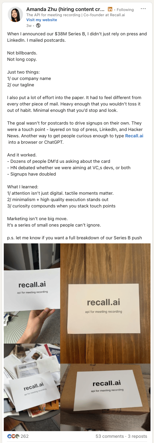
2. Funding announcement idea from Recall.ai
How about this idea of sending postcards:
Take a nice piece of paper
Print your company name on it
Print your one liner on it (bonus points for saying what you do ;))
Create a list of ICPs with office addresses
Send those postcards to them
…
Wait for ppl to reach out
This is what Recall.ai did and I love it. Another example of doing something different rather than just better. Creativity seems to be back in marketing grace ;)
Need more developer marketing insights?
1. Work with me 🍐
"Thanks so much for your time and all the thoughtful feedback coming from the workshop.
I feel like we are in a much better place to start our website rebuild. "
If you want my help I do Workshops (60-minute session on whatever you want), Teardowns (audit+suggestions for your homepage, messaging, ads etc), and longer-term Advising.
2. Bonus links to check out
3. Join our Slack community
"Been here 20 min and already folks are sharing great advice."
2000+ dev tool CMOs, heads of growth, product marketers, and other practitioners talking shop.
Reply